How you can use data visualization in healthcare operations


How is data visualization used in healthcare?
Data visualization in healthcare turns raw medical data into charts, graphs, and dashboards that teams can read at a glance.
- It helps doctors and staff spot trends and patterns fast.
- It supports better choices on patient care and daily work.
- It makes complex data easy to share across a busy medical team.
Data visualization in healthcare has become a key tool for medical groups today. It helps them make sense of large data sets. As a result, they can find useful insights quickly.
Healthcare runs on a lot of automation and apps. So processing all that data can feel heavy for busy doctors. This gets harder when they also run their own practice. For teams that lean on healthcare BPO support, clear visuals keep everyone on the same page.
This article explains data visualization in healthcare and why it matters in medical work.
What is data visualization in healthcare?
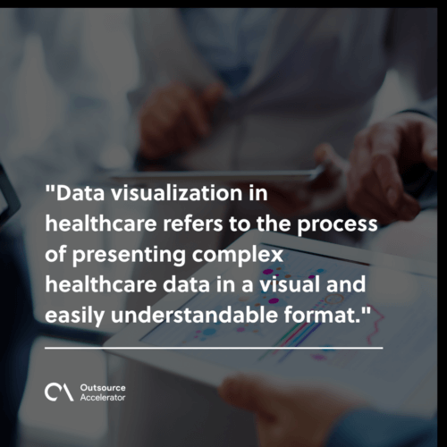
Data visualization in healthcare means showing complex healthcare data in a simple visual form.
It uses charts, graphs, and other visual tools. These display data from findings, medical transcriptions, and other records. As a result, teams can read the numbers without digging through raw files.
Turning data into visuals helps medical staff track trends and spot patterns. So they can plan better patient care. Many teams pair these visuals with healthcare data analytics for deeper insight.
Examples of data visualization in healthcare
There are many examples of data visualization in the healthcare field. Each one aims to improve care and daily work.
Dashboards for emergency rooms
One example is a dashboard that shows live wait times in the emergency room. This helps hospital admins find bottlenecks. As a result, they can act fast to keep patients moving.
Charts for patient outcomes
Another example is a chart of patient outcomes. Staff plot patient data over time on a graph. So they can see patterns and trends in each patient’s progress.
This data can then shape treatment plans. In addition, it helps improve patient experience overall.
Importance of data visualization in healthcare
Data visualization in healthcare matters for a few clear reasons.
Enhanced decision support
First, it makes choices easier by showing complex data in a clear way.
Large data sets can feel heavy. However, visuals make patterns and links stand out. As a result, healthcare staff can make better decisions.
Transparency
Second, data visualization builds transparency in healthcare work.
Teams can see which areas need work. They can also track patient outcomes, surgery success rates, or medication errors. Because of this, the whole team stays accountable.
Still, the main gain is trust. Clear data drives steady gains in care quality.
Enhanced collaboration
Third, data visualization helps teams work together.
Visuals are easier to grasp than long reports or spreadsheets. So staff can share findings, involve stakeholders, and push positive change as a group.
Data visualization techniques in healthcare
Healthcare teams use several data visualization techniques to present complex data. Here are three popular ones.
1. Line graphs
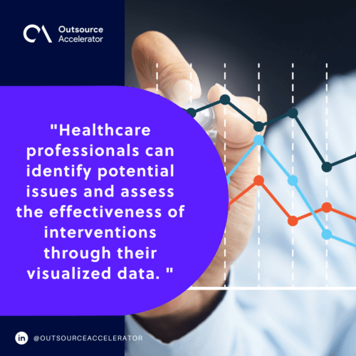
Line graphs help track trends and changes over time. For example, a line graph can show shifts in vital signs, such as heart rate or blood pressure.
By plotting this data, staff can spot odd trends early. As a result, they can step in fast.
2. Heatmaps
Heatmaps use color coding to show patterns across a data set.
In healthcare, heatmaps can map patient demographics or disease rates by region. So teams can see where certain diseases cluster. Because of this, they can send resources where they are needed most.
3. Geographic information systems (GIS)
GIS mixes geographic data with other data to give useful insight.
In healthcare, GIS can map disease outbreaks and track the spread of infections. It can also flag regions with too few services. As a result, teams can plan and place resources well. Public health leaders often pair this with a solid business intelligence strategy to guide bigger decisions.
Interpreting data in healthcare operations
Data visualization is vital. Still, reading the visuals well matters just as much. Staff must study, interpret, and draw clear insights from the data.
Good reading helps teams spot issues early. It also shows whether a fix is working.
In addition, strong data reading in healthcare can lead to:
- Better patient outcomes
- Lower costs
- More efficient healthcare work
Teams that store records in electronic health records get cleaner inputs for these visuals.
Frequently asked questions about data visualization in healthcare
What is data visualization in healthcare?
It is the use of charts, graphs, and dashboards to show medical data in a clear visual form. As a result, teams can read complex data fast and act on it.
Why is data visualization important in healthcare?
It supports better decisions, more transparency, and stronger teamwork. Because of this, hospitals can improve care and cut waste.
What tools are used for healthcare data visualization?
Common tools include line graphs, heatmaps, and GIS maps. Many teams also bring in big data consulting help to handle large data sets.
Can data visualization improve patient care?
Yes. It helps staff spot trends in patient data early. So they can adjust treatment plans and lift outcomes.
Should healthcare data visualization be outsourced?
It can be. Skilled offshore teams can build and run dashboards at lower cost. This frees in-house staff to focus on patient care.
Key takeaways
- Data visualization in healthcare turns raw data into clear visuals for faster decisions.
- Line graphs, heatmaps, and GIS are three common techniques.
- Clear visuals boost transparency, teamwork, and patient care.
- Reading the data well is as important as building the charts.
- Outsourcing can add skilled help at a lower cost.
Partner with Connext Global for effective data visualization solutions
Connext Global offers data visualization solutions built for healthcare needs. Beyond the tech, it uses skilled offshore teams to streamline work and pull data together.
Do you want to learn more about data visualization for your healthcare work? Then visit Connext Global.




 Independent